What Claude Design actually is
Claude Design is Anthropic's answer to the question: what if the gap between "I want this" and "here is a working prototype of this" was a single conversation? It launched on April 17, 2026 from Anthropic Labs, and is built on Claude Opus 4.7. You describe a screen, a deck, a one-pager, a wireframe. Claude builds a first version on a canvas next to your chat, and you push it around from there.
It is not Figma. It is not Canva. The clearest way to think about it: Claude Design lives in the part of the workflow where you used to brief a designer, then wait. The output is a real, interactive prototype, not a flat mock, and it is wired straight into Claude Code for the build.
Who it is actually for
Anthropic positions Claude Design at "founders and product managers without a design background." That is true, but undersells it. The biggest unlock I have seen is for designers and engineers who already know what good looks like. Claude Design just removes the keyboard friction between the idea and the first artefact you can react to.
- Founders and PMs: for pitch decks, landing pages, and cofounder-of-design moments where you need a real artefact in an hour, not a week.
- Designers: for exploration. Generate three directions in 90 seconds, then pull the best one into Figma to finish.
- Engineers: for the front-end you have been putting off. Brief it, hand the bundle to Claude Code, ship.
- Marketers: for one-pagers, social cards, and landing variants without bothering the design team.
The interface: chat on the left, canvas on the right
The whole tool is two panels. On the left: a chat thread, the same shape as Claude.ai. On the right: the canvas where the design lives. You talk in the chat, the canvas updates. That is the entire interaction model.
Before the canvas opens, you set up the project. The sidebar offers four project types:
- Prototype: multi-screen, interactive. The default for app and web work.
- Slide deck: pitch decks, internal updates, anything PPTX-shaped.
- Template: start from a known structure (landing page, dashboard, onboarding flow).
- Blank: for when you know exactly what you want and the templates are in the way.
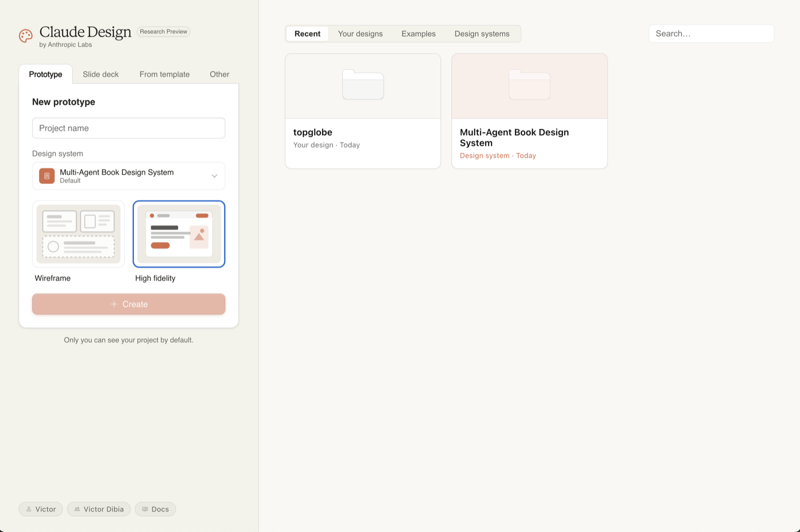
Pick the closest match. You can change scope mid-project, but the first choice nudges Claude toward different defaults, slide decks get title-card thinking, prototypes get state and interactivity baked in from the start.
Step 1 · Set up your design system first
This is the single highest-leverage thing you can do, and most people skip it. Without a design system, Claude Design produces what one reviewer called "functional but generic" output, perfectly serviceable, generically AI-ish. With one configured, every new project inherits your colours, typography, and components automatically. The first draft already looks like your product.
During onboarding, Claude builds the system by reading whatever you point at. The more useful the source, the better the system.
What to feed it
- A GitHub repo: the strongest signal. Claude reads your tokens, components, and Tailwind config directly.
- Existing design files: if you have a Figma library, point it there.
- Brand guidelines (PDF or DOCX), colours, typography, spacing rules.
- Logos and font files: name them clearly. "logo-dark-bg.svg" is more useful than "logo3-final-v2.svg".
- Slide decks that already use the brand correctly, surprisingly effective when you do not have a design system documented anywhere.
You can maintain multiple systems and switch per-project. If you work on two products, set both up once and pick the right one when you create a project. This is also how agencies should be using it: one system per client.
Step 2 · Write a brief, not a prompt
The single biggest predictor of output quality is the brief. Anthropic's own examples, and every hands-on review I have read, converge on the same template. Four elements, in this order:
Skip any one of those four and Claude will guess, sometimes well, often generically. The reason this works is the same reason it works for any LLM brief: explicit constraints remove variance.
A bad prompt vs a good one
If your brief is genuinely sparse, you really do not know yet, it is fine to start vague and let Claude ask. The tool will pause and ask follow-up questions when it is uncertain, which is often more productive than guessing. Treat those questions as the brief writing itself.
A copy-paste starter template
The "reference" line at the end is the secret weapon. "Closer to Linear than to Asana" or "Eames-era industrial" or "Stripe Press but darker" anchors the entire output in seconds.
Step 3 · Bring real context
Claude Design accepts more input than any other AI tool I use. Use that. Every piece of real context you give it is one fewer thing it has to invent.
What it accepts
- Text and images: drag screenshots, sketches, mood boards straight into chat.
- Documents: DOCX, PPTX, XLSX. A spreadsheet of your real product data turns a chart into your chart.
- Codebases: point Claude at a repo. Useful when the design needs to fit existing code, not just brand.
- Web capture: point Claude at any live URL and it pulls the colours, typography, and layout patterns directly. This is the single underused feature.
The web capture tool is genuinely the difference between a generic mockup and one that looks like the real product. Pull your own marketing site, your competitor's app, the Stripe docs, anything Claude can read becomes anchor material.
Step 4 · Iterate with the right tool for the job
There are four ways to refine a design in Claude Design. They are not interchangeable, each is best at a different kind of edit. Picking the right one is the difference between fast iteration and re-prompting the same thing four times.
The four refinement modes
- Chat: for broad, structural change. "Try a darker theme." "Show me two layout alternatives." "Move the pricing above the features." Use chat when you cannot point at a specific element.
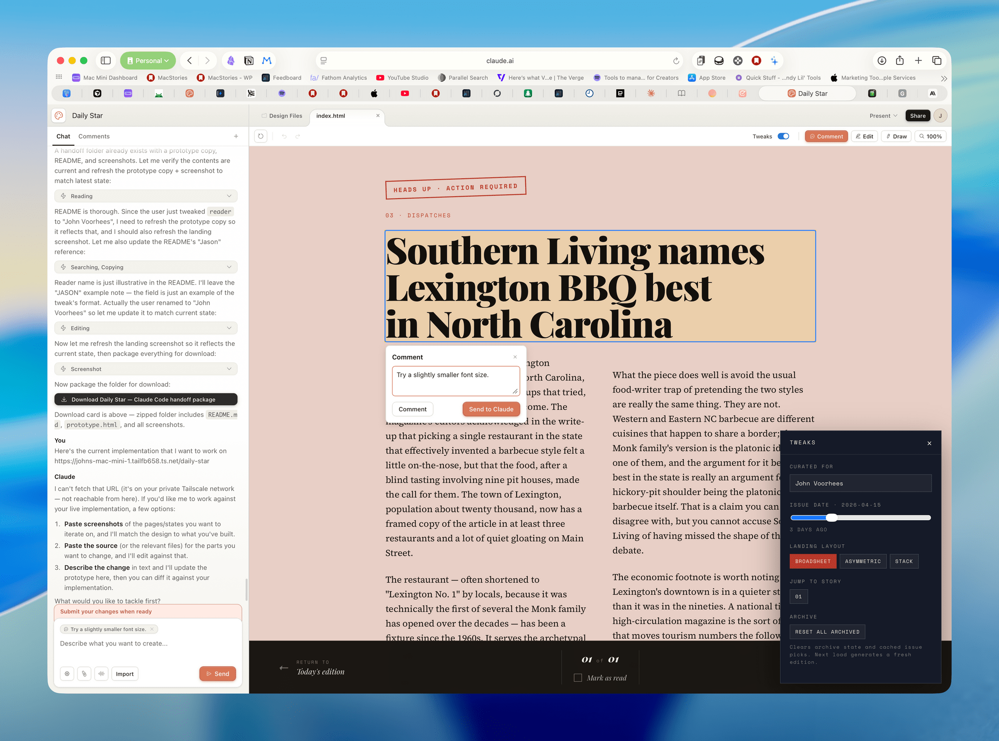
- Inline comments: for targeted change to a specific element. Click the element, drop a comment, Claude applies the edit. "Make this button less prominent." "Replace this with a real testimonial." Use this when you can point.
- Direct text edits: when the design is right but the copy is wrong. Just click and type. No re-prompting needed.
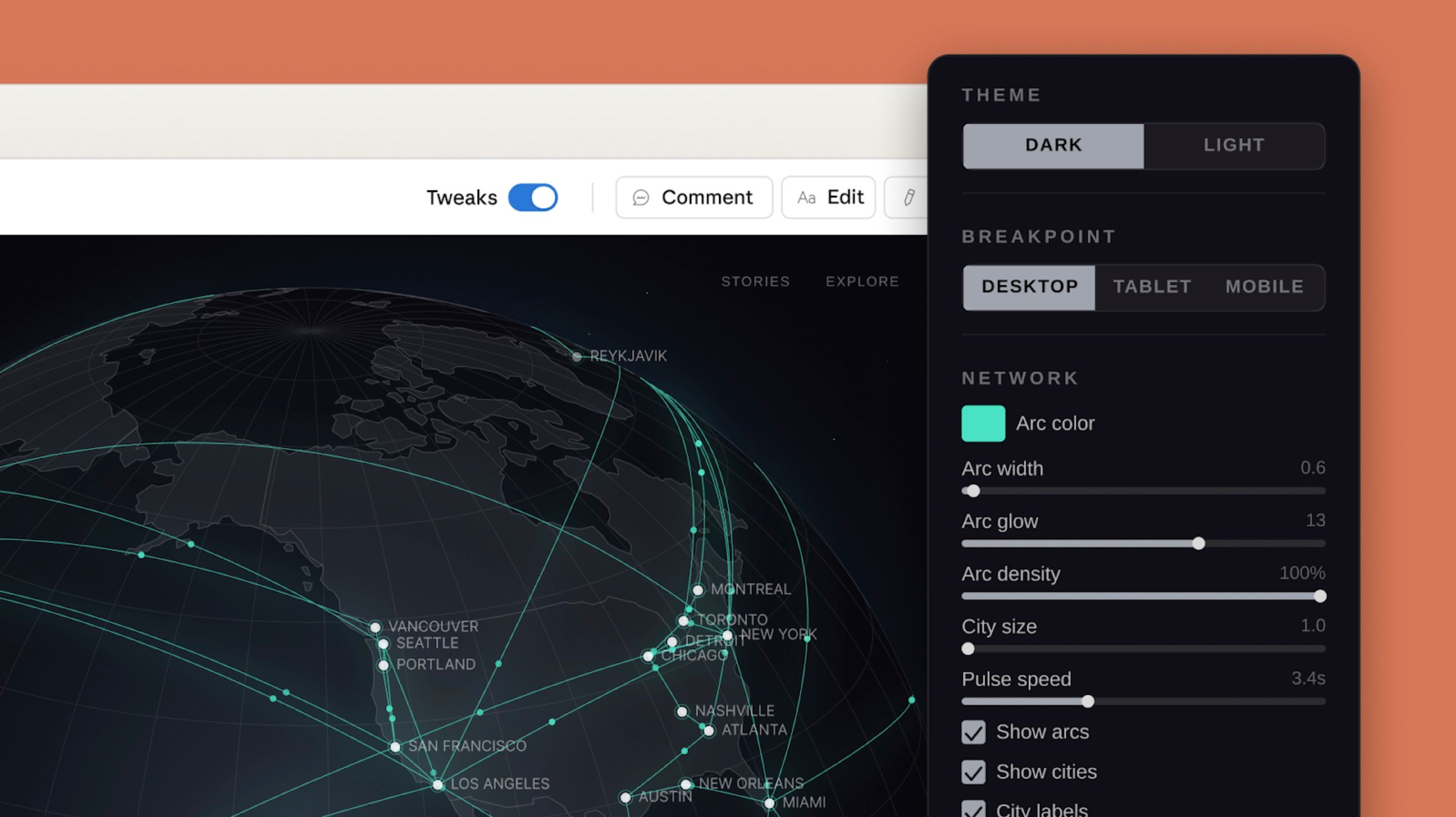
- Adjustment sliders: Claude generates project-specific sliders for spacing, colour, hierarchy. Drag, see live changes, commit. The fastest way to explore a small variation space.
When to use which
A simple rule: the more global the change, the higher up that list you go. Re-themes go in chat. "This button" goes in inline comments. Typos go in direct edits. Spacing exploration goes in sliders.
Save and fork: the move most people miss
When you have a version you like and want to try something dramatically different, you can ask Claude to "save what we have and try a completely different approach." This forks the current state and gives you a clean slate without losing the previous direction. Treat it like a git branch, cheap, encouraged, reversible.
Step 5 · Hand off to Claude Code
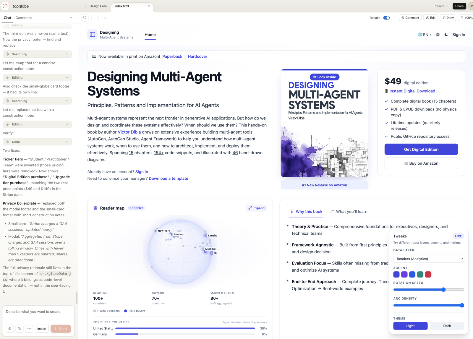
Once a design is ready, Claude Design packages everything, the design tokens, components, layouts, and your design-system context, into a "handoff bundle" that you pass to Claude Code with a single instruction. This is the closed-loop advantage; it is also where Claude Design earns its keep over Figma in many flows.
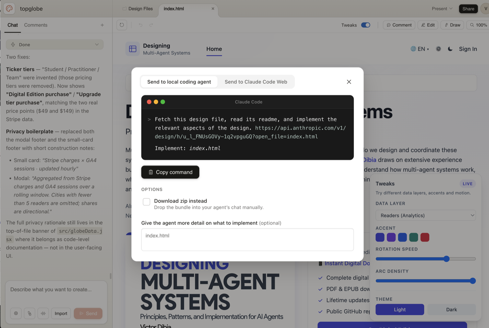
The handoff is a button in the Export menu. You can target the local Claude Code agent or the web version. The bundle includes everything Claude Code needs to translate the design into real code in your existing repo, against your real components, not generic Tailwind soup.
Getting the handoff right
- Be specific about data sources. "Wire the dashboard to the /api/metrics endpoint, the response shape is in lib/types/metrics.ts."
- Be specific about interactivity. "The pricing toggle should change the price displays; everything else stays static for v1."
- Be specific about scope. "Build the marketing page only. The /app routes are already wired, do not touch them."
- Hand it off through the bundle, not by pasting screenshots. The bundle carries the design-system context; screenshots throw it away.
What it is good at, and what it isn't
A short, honest list. Claude Design is excellent at some things and clearly early at others.
What it nails
- First drafts. Faster than any other tool I have used at "give me something to react to."
- Brand-accurate output once a design system is set up. The difference is night and day.
- Multi-screen prototypes with real navigation. Most AI design tools stop at one screen; this one understands flow.
- The exploration loop. Three directions, side by side, in 90 seconds.
- Handoff. The Claude Code bundle is genuinely the cleanest design→code path I have seen.
Where it is early
- No native Figma import or export. If your team lives in Figma, this is friction.
- Frontier features (3D, voice interfaces, video-rich prototypes) work but are visibly experimental, fine for spike prototypes, not for production demos.
- No audit logs or admin reporting yet. Enterprise teams will want this before rolling it out widely.
- Comments occasionally drop. Workaround above; not a dealbreaker, but worth knowing.
- Large repos cause lag during design-system extraction. Link the UI subdirectory, not the monorepo.
None of these are deal-breakers. They are the things to know going in so you do not get caught out.
A complete walkthrough: what I would actually type
Concrete is better than abstract. Here is the exact sequence I would run to take a real product idea, a pricing page for a fictional analytics tool, from blank canvas to handoff in about 20 minutes.
1. Project setup
New project. Type: Prototype. Name: "Glance: pricing page v1". Pick the right design system from the dropdown (assume one is already configured).
2. Capture context
Drag in three things: the Glance marketing site URL (web capture), a screenshot of Linear's pricing page (style anchor), and a one-page Notion doc with the actual tier definitions.
3. The brief
4. First reaction
Claude returns a draft in under a minute. Three changes I would make immediately, using the right tool for each:
- Hero feels generic: chat: "The hero sentence is forgettable. Try three more options that lead with the speed advantage."
- Middle tier card looks too similar to the others, inline comment on the Team card: "Add a subtle ‘Most popular' badge and lift the elevation slightly."
- Pricing numbers are off: direct text edit. Click, type, done.
5. Explore an alternative
"Save what we have. Try a second version where the comparison table is the hero and the tier cards live below it." Now I have two versions, side by side. Pick the better one or splice the strongest parts of each.
6. Hand off
Export → Hand off to Claude Code. The instruction I send: "Build this in apps/marketing as /pricing. Use our existing PricingCard component (apps/marketing/components/PricingCard.tsx). Wire the trial CTA to the existing /signup flow. Static page, no need to fetch tier data, the values from the design are correct."
Claude Code takes it from there.
Five mistakes I keep seeing
- Skipping the design-system setup. Output without a system is generic; with one it is yours. This is the highest-ROI 30 minutes you will spend.
- Treating it like a prompt box. Briefs are not prompts, write four lines, not one.
- Not using web capture. The single most underused feature. Your competitors' sites, your own product, the brand you wish you looked like, all anchor material.
- Re-prompting when an inline comment would do. Re-prompts often regenerate everything. Inline comments target one element. Pick the right tool.
- Treating Claude Design as a Figma replacement. It is not. It is the layer between brief and Figma, or between brief and code. Use it where it shines; do not force it to be something it isn't.
Where to go from here
Three things, in order, if you have not used Claude Design yet.
- Spend 30 minutes setting up your design system properly. Point at the most current source you have, repo, Figma, brand PDF.
- Build something small you genuinely need. A pricing page, an internal dashboard, a deck. Go through the full loop including handoff.
- On round two, try the web capture tool. Once you have seen what it does to first-draft quality, you will use it on every project.
Claude Design is two months old as of writing. It will keep moving, the best thing you can do is build the muscle now, before everyone else does.
Further reading
- Anthropic: Introducing Claude Design (anthropic.com/news/claude-design-anthropic-labs)
- Anthropic Help Center: Get started with Claude Design (support.claude.com/en/articles/14604416)
- MacStories: Hands-On with Anthropic Labs' Claude Design Preview
- DataCamp: What Is Claude Design? Anthropic's AI Design Tool Explained
- BuildFastWithAI: Claude Design: Complete Guide for Non-Designers (2026)
- TechCrunch: Anthropic launches Claude Design, a new product for creating quick visuals